
With the Paris climate talks just around the corner a focus on carbon dioxide is not enough. Geoff Russell explains.
With yet another in the seemingly infinite sequence of climate summit conferences looming it’s time to take stock of what’s been happening over the past 25 years. But I’ll be taking stock properly, which means not being CO2 centric. Focusing exclusively on CO2 is rather like focusing on protein when thinking about nutrition: it’s simply silly.
It’s been seven years since Barry Brook and I wrote an article about the misleading nature of the so-called “carbon dioxide equivalence” factor used to aggregate methane emissions in Greenhouse Inventories. This isn’t a priority claim; many understood the problem before us. Among the first was Kirk Smith of the University of California, Berkeley. Smith is an expert in air quality, among other things, and was the first to measure and understand the impact of indoor cooking smoke on health in India. Globally, it kills people, mainly women and children, by the hundreds of thousands every year. He’s also been tackling the problem in a practical way by spinning off students and companies designing and building cleaner cookers.
Smith’s latest work, with main author Manish Desai, calculates a metric called the International Natural Debt (IND) which is a better than average measure who is responsible for our climate woes.
Their study uses national emission inventories and greenhouse gas equations to calculate precisely the impact of emissions on radiative forcing (that’s just jargon for warming). In effect, while they don’t include all the components of a full climate model, they do at least account for the full impact of methane on warming. Their estimate, based on the best inventory data is that anthropogenic methane, on its own, contributes about half of our net warming influence on the climate. In technical language methane is about ~850 mW/m2 of the net ~1600 mW/m2 of anthropogenic radiative forcing. That makes methane a big deal. Even more importantly, reductions in methane have an almost immediate cooling impact.
I feel compelled to add a caveat here. Methane reductions mustn’t come at the expense of CO2 reductions, but be in parallel with CO2 reductions. The two gases function differently in the atmosphere. The notion some factor enables you to compare emissions of different gases is convenient, but not literally true. Similarly, digesting a gram of protein gives the same amount of energy as a gram of carbohydrate, but that doesn’t make them equivalent.
That done, here’s what I think is the key graphic from Desai and Smith’s paper. Non-technical readers mustn’t panic. Nobody takes in graphs like this with the speed of a three word slogan, they must be studied slowly. I’ll point out a few highlights below.
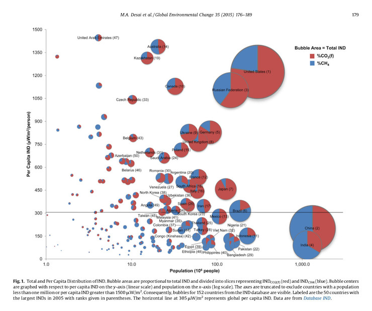
Firstly, the ratio of blue to red in each disk is the ratio of warming due to methane and carbon dioxide. It’s about 50/50 in Australia. Which isn’t surprising with our 29 million cattle, 72 million sheep and just 23 million people. The size of the disk is a country’s accumulated total impact on warming over time. Despite our small human population, our accumulated climate impact is right up there with France, with its 66 million people. It’s not always the human population that determines a country’s environmental impact.
Secondly, the y-axis measures per capita warming and we are second only to the United Arab Emirates. Our per capita emissions are 4.5 times the global average. It’s a chilling indictment not just on Australia’s lack of emission reductions but also on our national ignorance about our particular mode of climate vandalism.
But the Desai and Smith paper doesn’t probe down to the sector level to distinguish sources of methane, which may well vary from country to country. So let’s dig deeper using UNFCCC national inventories for four countries: Australia, Germany, France and Russia.
First the overview. Again, don’t panic.
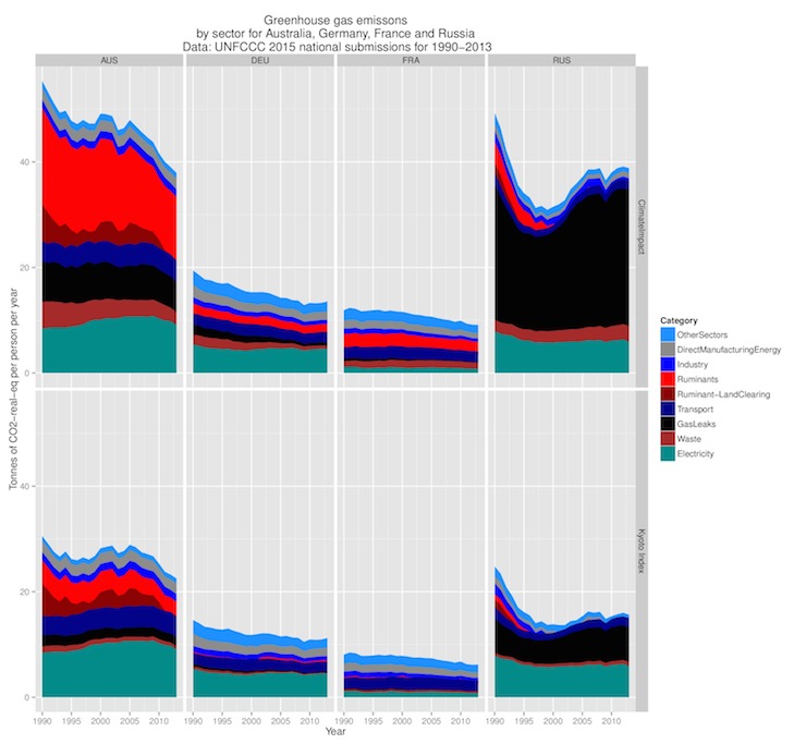
There are two rows of panels in this graph and they illustrate the per person greenhouse gas emissions by sector over time. The horizontal bands represent warming impacts for a sector. A big band means a big impact.
Look first at the bottom row of panels. Under the Kyoto protocol, a tonne of methane is said to be equivalent to 25 tonnes of CO2, and that’s the factor used in the construction of the bottom row of panels. As you can see, this factor disguises the impact methane has in both climate models and the real world; the actual impact is given by the top row of panels.
In the top row I’ve approximated the physical impact of methane by using a factor of 105, based on the relative impact of a tonne of methane to a tonne of CO2 during the first 20 years after its release. Now we can see why Australia is heating well above its weight in the climate stakes.
The big red area is those 29 million cattle and 72 million sheep. It’s the methane they produce from digestion together with methane generated from manure. Clearly, meaty methane in Australia is a bigger factor than electrical CO2. The other thing to notice is how bloody big the Gas Leaks band is in Australia and Russia. These are quaintly called ‘Fugitive Emission’s in the official inventories.
Natural gas is just methane and it doesn’t take much of a leak from a gas field to obliterate any so-called gains from the fact that it produces less carbon when burned. Which is exactly what’s been happening. Recall that Russia now exports plenty of gas to Western Europe and plenty of the reduced emissions in that part of the world have merely been outsourced to Russia. Would the rise of gas and gas fracking have occurred if methane was more properly represented in official inventories?
The graph also makes obvious, particularly in Australia and Russia’s case, that the climate problem is much bigger than electricity – not just bigger, in fact, but more diverse. We have to learn to cycle, chew gum, and juggle at the same time, while also dictating scientific papers into our smart phones.
But the vertical scale of this graph was determined by Australia and Russia, so the sector bands for France and Germany don’t give much away, with one exception. Look at the green band at the bottom of the three top panels. That’s almost all carbon dioxide from electricity generation and illustrates the impact of three strategies in tackling clean electricity production: 1) Ours, which is to do nothing, 2) The German renewable energy push, which has been running since 2000 and looks rather like our approach, but with better marketing, 3) the French nuclear solution. They decarbonised in about 15 years prior to 1990 and have had clean cheap electricity ever since.
Notice, however, that all the graphs are trending down, which is a good thing. But it’s rather difficult to work out which sectors have made progress and which haven’t from these graphs. Mainly because of the scale required to contain Australia and Russia’s bloated emissions. So let’s look now at some graphs of changes since 1990 by sector.
First Australia.
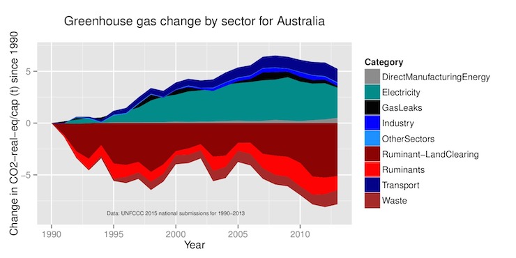
With this graph we can see exactly what’s been happening here. Massive increases in electricity emissions until the GFC of 2008, coupled with reductions in land clearing, waste emissions, and a crash in the wool market in the early 1990s which saw the sheep population drop from 173 million sheep in 1990 to just 72 million now.
Now let’s look at Germany. The difference is stark. Most sectors in Germany show serious emission reductions until 2008 and then a slight shuddering, but no real progress.
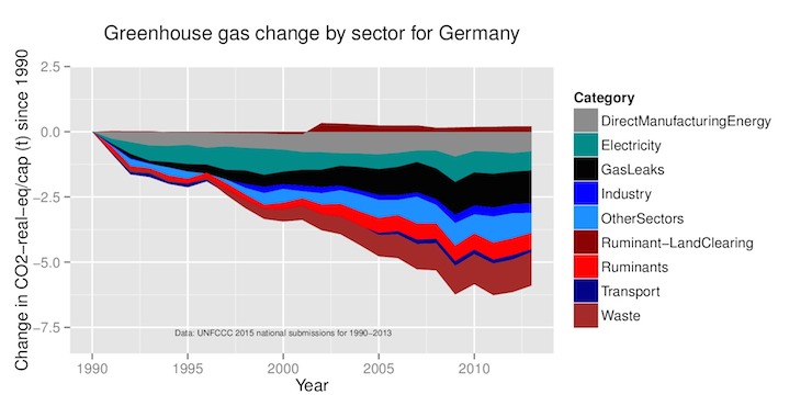
But what remains impressive is the evenness of the German response; it’s clearly been working in most sectors. For example, Germany has gone from 19 million cattle to just over 12 million. Three sectors buck the trend: transport, electricity and what I’ve called Direct Manufacturing Energy. I’ve no idea about the last but it’s clear what’s been happening with electricity.
The graph shows that the Germans initially made progress cleaning up their electricity in the early 1990s. Why? This was when they were switching capacity to four large nuclear power stations completed in the late 1980s. The relatively low height of their green electricity band to Australia’s is a result of their nuclear builds in the 70s and 80s plus a little of that Russian gas. But by 2000 that progress had ceased and so began the period of renewable hype, hot air, and bugger all actual progress.
Coal and gas simply haven’t been replaced. Renewables have added to Germany’s electrical output rather than replacing anything except nuclear. You can cherry pick the data all you like and shout loudly about this or that wind or solar farm providing clean energy for thousands of homes; the bottom line is the impact on the emission inventories and that has been, as you can see, half of bugger all.
And France?
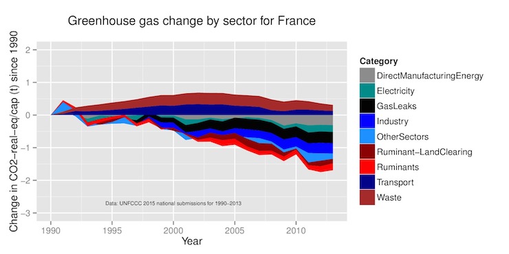
First notice the change in vertical scale. While not as shameful as Australia, France looks to have been resting on its nuclear laurels in comparison to Germany. But at least it has some laurels to rest on.
And lastly Russia. Again note the change of scale.
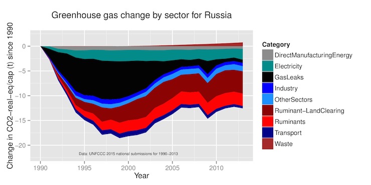
Looking at this graph, plus the first in the article, and we can see that their emissions were plummeting in the early 1990s. You can see why here; they just stopped producing electricity. As output expanded and the Russian economy picked up, so did gas and gas leaks. But they have done well in reducing land clearing and cattle.
So as the Paris Climate talks progress, I wonder whether the players will notice methane. If I had access to how the event was being catered, I could probably guess the answer. I suspect it will be slap another slab of Wagyu on a gas fired BBQ and watch everything burn!

Donate To New Matilda
New Matilda is a small, independent media outlet. We survive through reader contributions, and never losing a lawsuit. If you got something from this article, giving something back helps us to continue speaking truth to power. Every little bit counts.


